Duration
3 month
Role
Sole UI/UX Designer
Skills
Research
Visual Design
Responsive Design
Design System
Renta is a peer-to-peer car-sharing app that lets car owners rent out their cars to people.
My Role
In 2022, I led the creation of Symbols' default design system in Figma, crafting a comprehensive style guide and components from atomic elements to larger organisms. I focused on making the system user-friendly, scalable, and efficient, allowing users to either customize designs or use the pre-built components to streamline their website-building process.
Problem
Nowadays in Georgia car rental process is hard and uncomfortable. During this process, you will meet many problems, such as communication problems, car availability checks, gathering all the information for every new customer, car screening to avoid possible misunderstandings, etc
Goal
For all these reasons i decided to create an application, that will help people to organize and manage all the mentioned problems above. My goal is to make these processes easy, comfortable, and enjoyable.
Competetive Analysis
Nowadays on the market, there are many websites and platforms where people can rent a car, but each of them offer users the same experience. User needs to find a car, and they have opportunity to see just the daily price and car description and facilities. That’s it. They can’t check any other information without calling to the car owner. Not even the availability dates.
The biggest player on the market is Myauto.ge. The main function of this website is to buy and sell cars, and rental experience is a minor functionality for them. For that reason, user experience is not as much as comfortable and improved as it can be and has to be.
Insights
At this step, I created a screener, conducted a survey, and defined my segment and target audience. The prospective users will then be approached through observation and interviewed on the problems usually encountered while using car rental services.
The audience was divided into two groups: Car owners and Renters.
First, I created a screener and conducted a survey by Google Forms. I questioned the potential target audience to find the right segment and person types for my interviews.
I decided to interview renters above 21 years who have a driver's license and have a min.2 years of experience in driving, and car owners who actually have the experience to rent a car or they want to rent a car in the future.
I conducted 1x1 interviews and found out my potential users' pain points, concerns, motivations, and ideas.
Survey & Interviews
In this phase, I conducted a screener and survey via Google Forms to identify target user segments, focusing on two groups: car renters and car owners. The target audience consisted of renters aged 21 and above with a valid driver’s license and at least two years of driving experience, alongside car owners interested in renting their vehicles.
Through one-on-one interviews, I uncovered several key insights regarding user pain points, motivations, and preferences:
Pain Points of Car Renters
Difficulty in locating available rental cars at preferred times and locations.
A cumbersome, time-consuming rental process.
Experiences of awkwardness or discomfort during rentals.
Previous positive experiences with rental apps, but a desire for a more user-friendly and enjoyable interface.
Specific challenges, such as:
Unclear pre-existing damages on rental cars.
Language barriers affecting communication with car owners.
Limited payment options, particularly for tourists.
Issues with checking car availability.
Pain Points of Car Owners
Need for quick and easy access to information.
Complexity in calculating additional services and variable pricing.
Difficulty in reaching a broader customer audience.
Challenges in verifying the condition of returned cars, especially concerning minor damages.
Requirements for gathering necessary documentation for new renters.
Preferences for accepting card or bank account payments.
Desire for greater control over additional service requests (e.g., car wash, refueling).
Flexibility in offering pickup and drop-off locations throughout the city.
These insights emphasize the necessity of developing a car rental app that addresses the needs of both renters and owners, ensuring a seamless, intuitive, and enjoyable user experience.
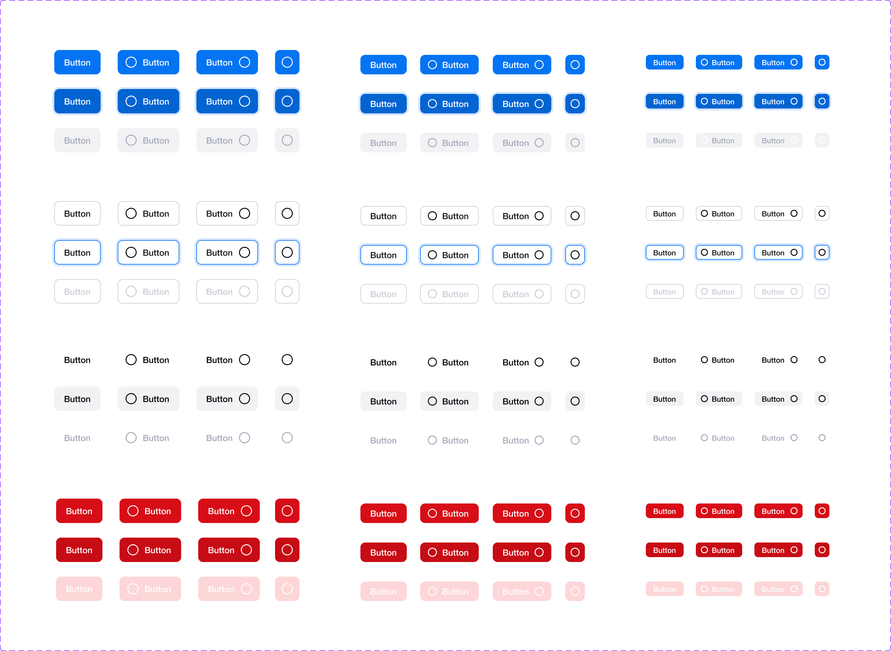
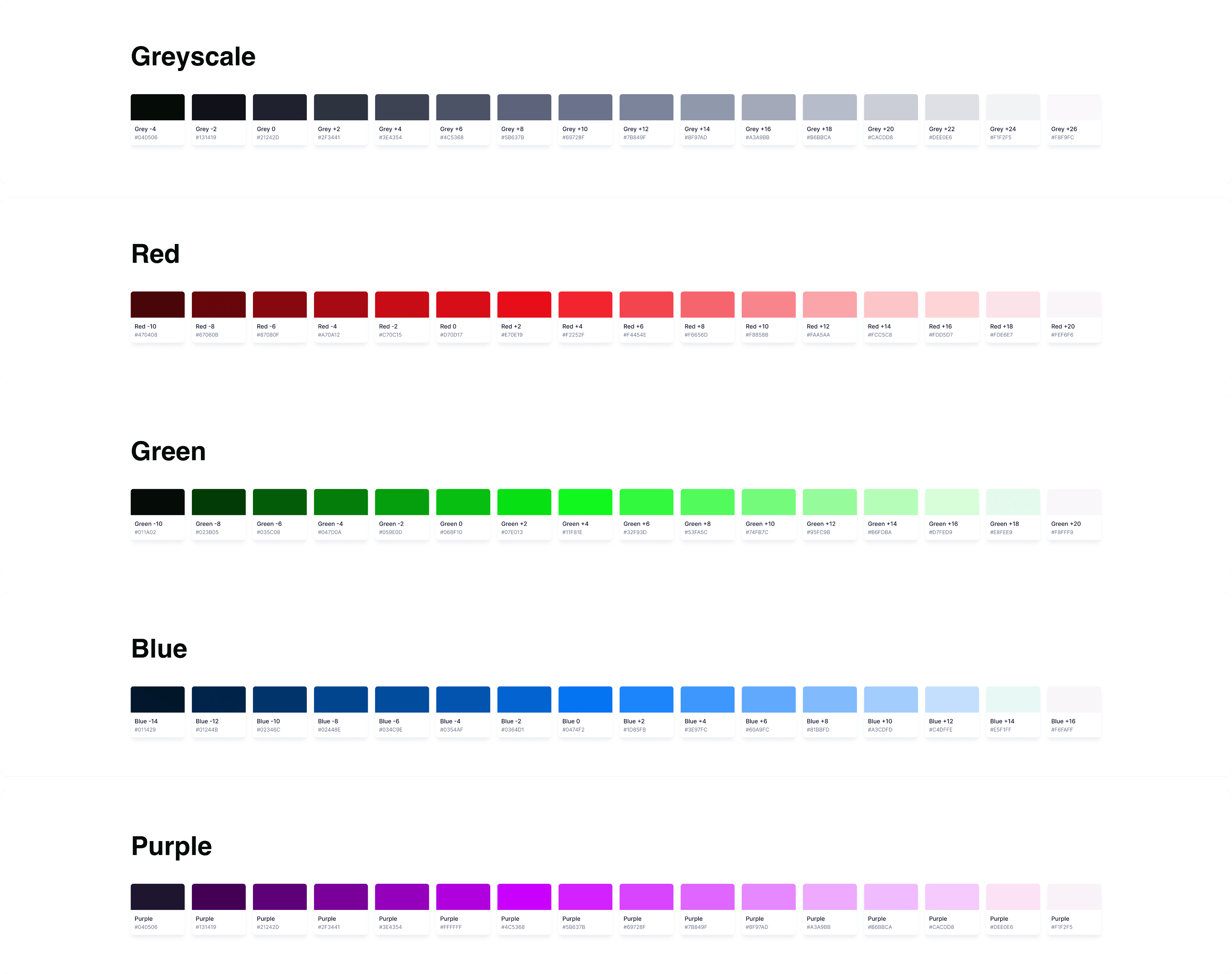
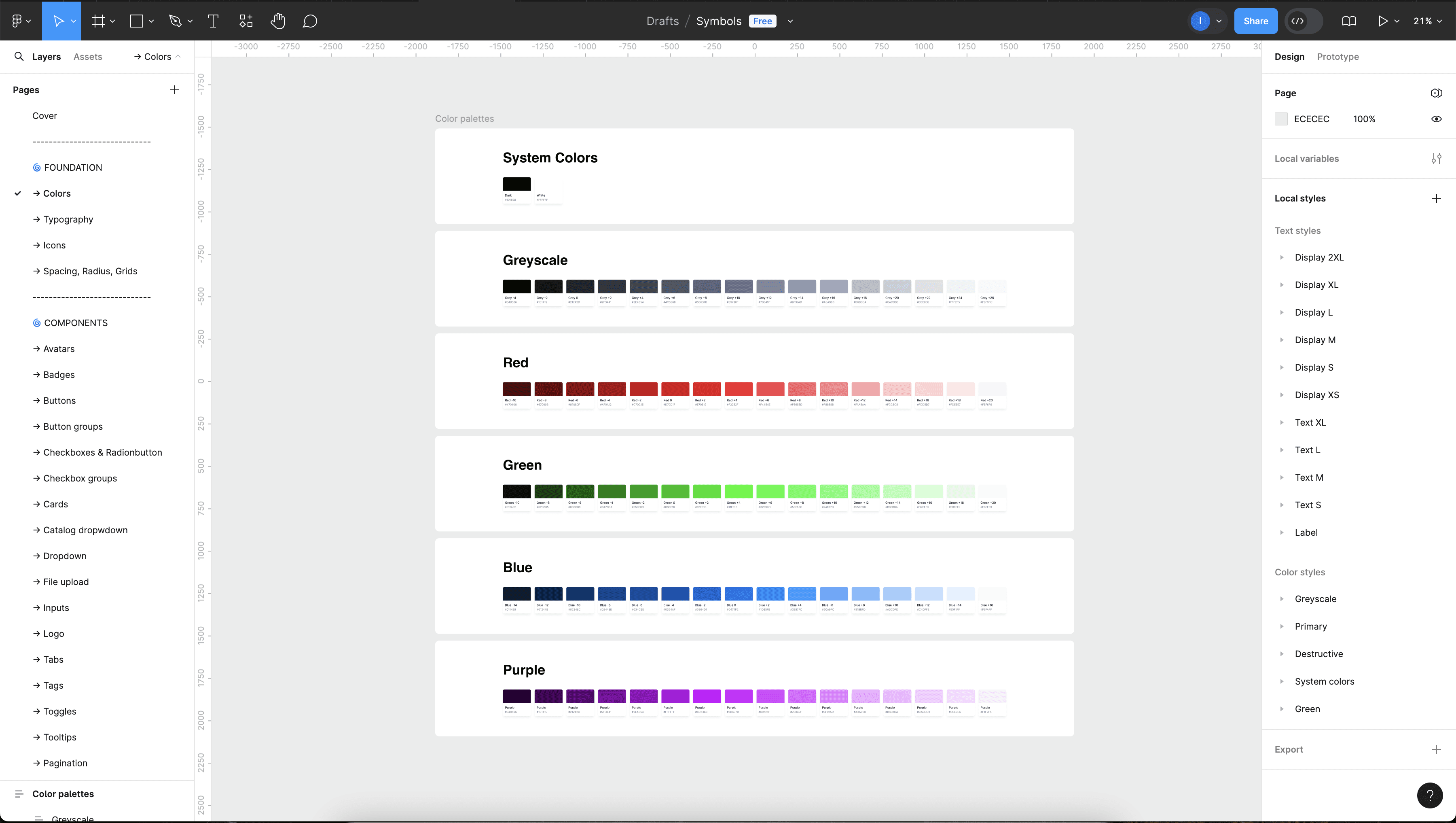
One of the first tasks was to establish the foundational elements, including typography and the color palette. Starting with Symbols’ brand guidelines, I expanded these elements to ensure they met the needs of all user types. This involved developing a comprehensive style guide that encompassed color choices, typography, spacing and alignment, iconography, and various UI elements.
The next step was getting started on an ever-developing set of components, guided by the Atomic Design approach. Continuously working with developers, we made sure that naming conventions and component organisation work for both sides: the Design System was mirrored in Storybook and a collaborative approach made the process more streamlined.
Instead of limiting ourselves to basic templates and organisms, we developed complete user flows tailored for various industries like e-commerce, SaaS, and fintech, ensuring our system was versatile for multiple fields.
I took the initiative to leverage the latest Figma features, leveraged variables, boolean properties, and dynamic width settings to make components more fluid and adaptable. By combining these features with device variations, we ensured the components were not just static but highly flexible, allowing for smooth customization and ease of use across different platforms.
Having the opportunity to build a Design System from scratch meant that accessibility became part of the process, rather than an afterthought.
Some of the key principles taken into account were:
checking colour contrast on different background and across different interaction states (this included me going down a deep rabbit hole of accessibility standards for disabled buttons)
ensuring font size + touch targets on mobile are appropriate
including text labels with icons on mobile navigation
consistency across layouts and similar UI elements
There is definitely room for improvements, as trade offs have to be made and time to ensure all standards are met is limited, but it sets us up on the right path and ensures that adherence to accessibility standards is a shared mission.
Summary
The Symbols design system project focused on creating a scalable, flexible framework that catered to a wide range of users, from beginners to advanced designers. By developing components based on the Atomic Design approach and incorporating accessibility from the outset, the system ensured ease of use and adaptability across various industries. Close collaboration with developers and continuous iteration allowed for the seamless integration of design and development, resulting in a comprehensive, user-friendly system that met both current needs and future growth opportunities.