One System, Every Screen: Scaling Design for a No-Code Builder
Design System Creation
Information Architecture
Process Optimization
Enterprise-Level Design
Symbols is the design system powering a no-code website builder — a library of responsive components, patterns, and templates that lets anyone design production-ready websites without touching code.

Introduction
When I joined, the builder had grown faster than its foundations. Components were duplicated across teams, the same button existed in a dozen slightly different versions, and templates felt generic and hard to customize. There was no single source of truth, so every new feature added more inconsistency instead of building on what already existed. I led the effort to turn this fragmented UI into a scalable, well-documented design system.
Role
I owned the design system end to end, auditing the existing UI, defining tokens and component architecture, rebuilding the core library, and setting up the templates and documentation that design and engineering now build from.


Challenges
No single source of truth
Components were scattered across files and teams, with no shared library. The same element existed in multiple, slightly different versions, making consistency impossible to maintain.
Components that didn't scale
Existing components broke across breakpoints and screen sizes. Every responsive edge case had to be handled manually, slowing down both design and build.
Generic, hard-to-customize templates
Templates looked the same for everyone and were difficult to adapt, so users couldn't get a distinctive result without heavy manual work.
Slow design-to-build handoff
Without shared tokens or naming, design and development spoke different languages. Handoff was slow, error-prone, and full of back-and-forth.
Inconsistent naming & structure
Layers, components, and styles followed no convention. Finding the right element meant searching through disorganized files instead of a predictable system.
No adoption or governance path
Even good components went unused because there was no documentation, no guidelines, and no clear way for teams to contribute or keep the system up to date.


Solution
I began with a full audit, cataloguing every component, style, and pattern across the product to map duplication and gaps. From there I defined a token layer (color, typography, spacing, radius, elevation) as the foundation everything else builds on, then rebuilt the core components on top of it with responsive behavior baked in.
With the foundation in place, I structured a template library that stays flexible: users start from professionally designed layouts and customize them without breaking consistency. Clear naming conventions and documentation made the system easy to navigate, adopt, and extend, so the design system scales with the product instead of fighting it.

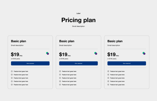
Design System
Built a comprehensive design system covering tokens, components, patterns, and templates, with usage guidelines for each. It gives design and engineering a shared language, keeps the product visually consistent as it grows, and dramatically speeds up how fast new pages and features ship.
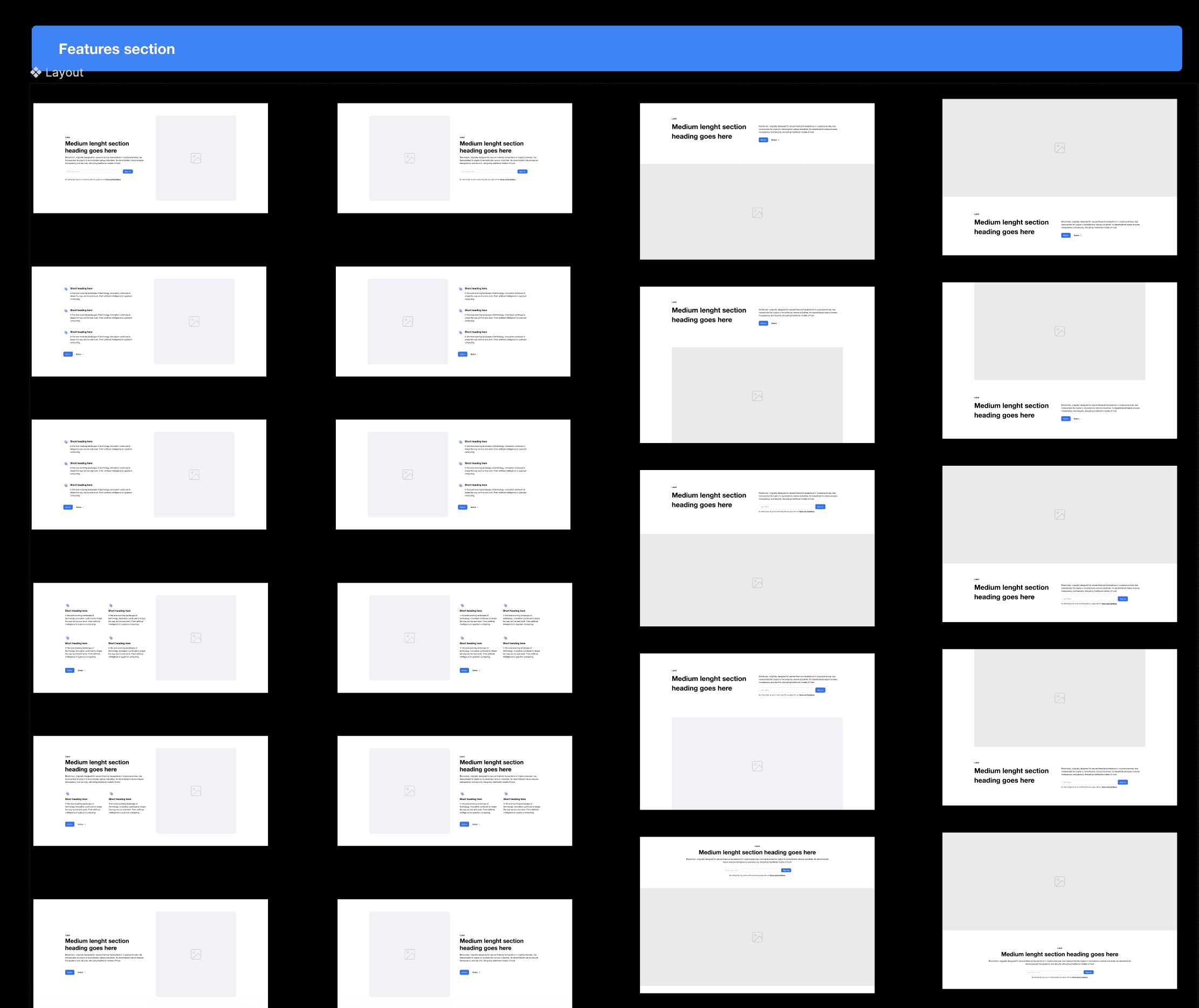
Outcome
After rolling out Symbols, the builder became faster and more consistent to work in. Teams now assemble pages from a shared, responsive library instead of rebuilding UI from scratch, cutting design-to-build time significantly and giving users higher-quality, on-brand results out of the box. The system became the foundation new features are designed and shipped from.