Dayhub is the first decentralized funded trading platform, designed to transform the proprietary trading industry through blockchain technology. It offers traders the opportunity to validate their skills by participating in challenges, and upon successful completion, gain access to substantial trading capital.
Duration
6 month
Role
Lead Product Designer
Skills
Product Design
Design systems
Web3
Information architecture
Responsive Design

Dayhub is a Web3-native platform with highly complex flows and tools for users, partners, and stakeholders. When I joined as the lead designer, the product was struggling with unclear navigation, visual inconsistency, and no design system in place. Users found it hard to understand or complete actions, and partners lacked confidence in the product experience. I was responsible for leading the full design overhaul and redefining the platform structure and usability.
My Role
I was responsible for leading the full design overhaul and redefining the platform structure and usability.
Challenge
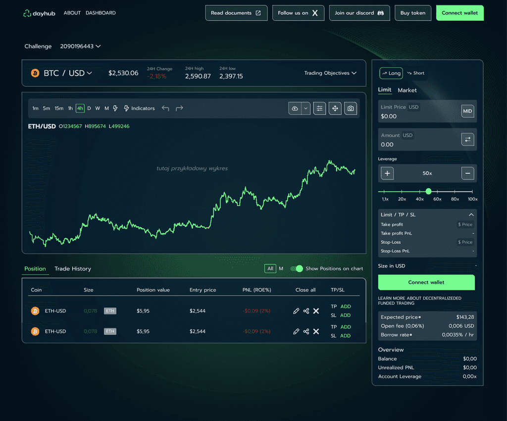
Old Design
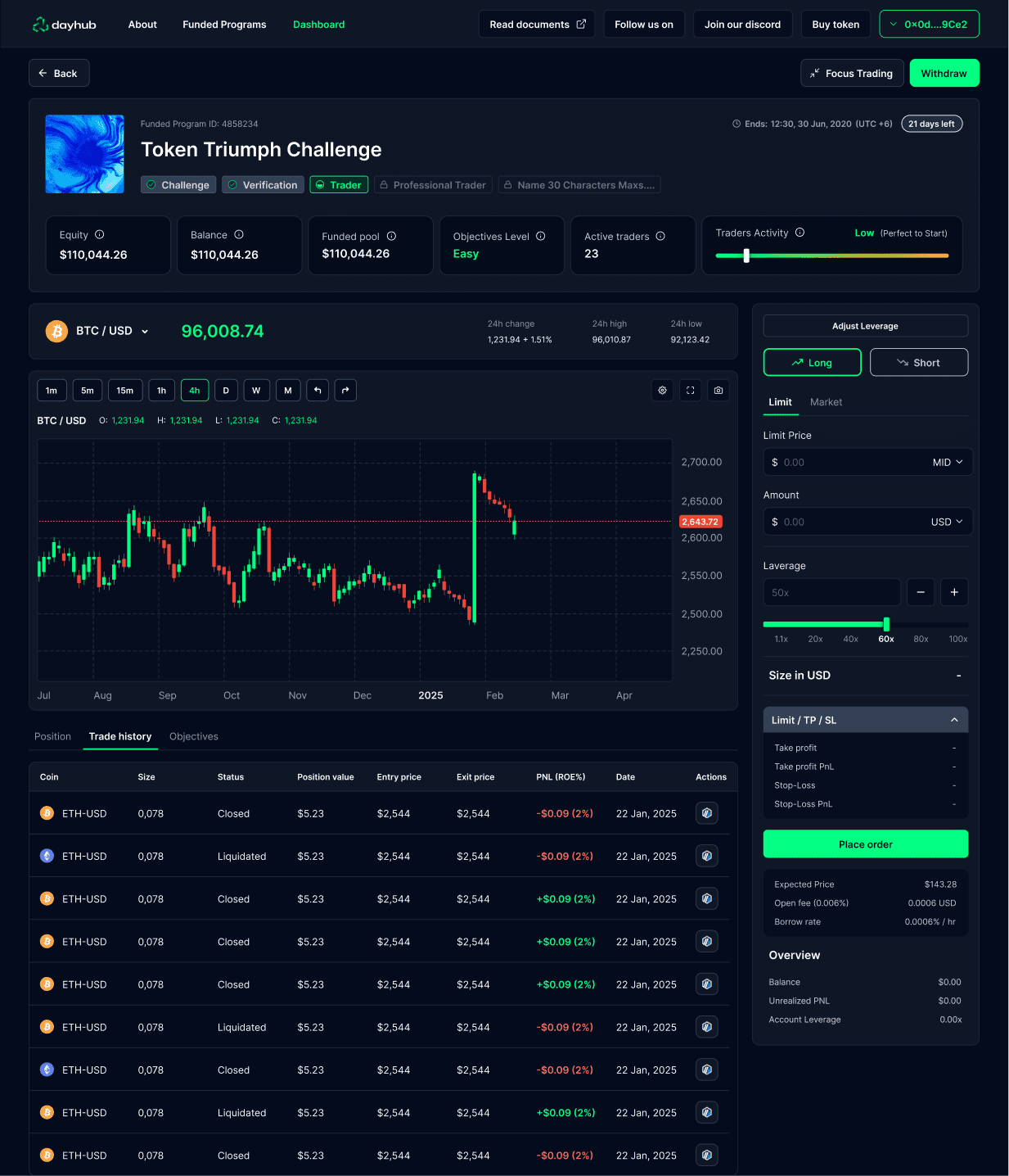
New Design
Solution
I started by mapping the entire platform — creating a sitemap, user journeys, and flow diagrams to uncover friction points. Established a scalable design system to bring consistency across components and layouts. With this foundation, I redesigned key pages and flows, including the challenges page and a fully functional dashboard that supports both power users and newcomers. Every decision was focused on simplifying the experience without sacrificing the depth of functionality.

Design System
Built a comprehensive design system covering components, tokens, and usage patterns, ensuring visual and functional consistency across the platform. It also improved collaboration between design and development.

Dashboard Redesign
Redesigned the core dashboard experience to support multiple user types. Key actions are now easier to access, and data is structured to surface what matters most to each user.


Funded Programs Page
Created a clear, interactive challenges page that allows users to engage with on-chain and off-chain tasks in a more intuitive way. The new layout supports gamification and progression logic without overwhelming the user.


Trading View
I designed a seamless Trading View integration that fits natively into the Dayhub dashboard. The layout allows users to monitor real-time token activity and technical data without leaving the platform. I focused on clear hierarchy, dark mode adaptability, and interaction states to ensure the module aligned visually with the rest of the system

Outcome
After launching the new platform, Simply Diagnostic saw increased trust and smoother conversions. Users now understand the product offering, can purchase tests easily, and navigate the process end-to-end—from browsing to registering their kit—on any device.